3D Logo Maker: AI Logo Creator
- 4.6
- Rating
- 5.00M
- Installs
- Free
- Price
 Analysis by App-foxy
I tried 3D Logo Maker: AI Logo Creator as a quick way to move from a vague business idea to something visual, and my first impression was that it is aimed at speed rather than full brand development. It belongs to the business category, is free to install, and focuses on creating logo concepts with an AI-assisted workflow. That makes it interesting for a new shop, freelancer, social page, or side project that needs a usable starting point without opening a desktop design program.
The important distinction is that I see this as a logo-making shortcut, not a complete identity studio. It can help me explore directions when I do not yet know what style I want, especially when a three-dimensional look fits the project. It is less convincing when I need a carefully controlled mark, a complete set of brand assets, or precise vector editing. That difference shapes nearly every part of the experience.
How the current version feels in everyday use
The app is developed by Maxlabs Graphic Design Tools and currently appears as version 1.10.23. It supports devices running Android 7.0 or later, which keeps it accessible on many older phones as well as newer models. I appreciate that the basic entry point is simple: I can approach it with a business name or an idea instead of needing to understand typography, grids, or professional design software first.
You May Also Like

 Blood Strike: 2.5 Anniversary
Blood Strike’s Loadouts Turn Every Drop Into a Tactical Gamble
A close look at Blood Strike’s custom loadouts: how fast access to signature weapons reshapes its battle royale rhythm, rewards preparation, and narrows the gap between fights.

 Pandora - Music & Podcasts
Pandora’s Music Is Easy to Start, but Harder to Recover
Pandora’s strength is its low-effort path from a seed to a station. Its weak spot is how much confidence it asks you to place in connection, setup, and quiet recovery.

 8 Ball Pool
 Is Built on Rivalries, Rematches, and Routine
A close look at the rivalries, rematches, shared routines, and unanswered safety questions that turn a quick pool match into a persistent mobile community.

 Samsung Music
’s Quiet Strength Is Playing What You Already Own
Its reach comes less from spectacle than from dependable access to a personal library. That simplicity is both the app’s strongest retention engine and its ceiling.

 AccuWeather: Weather Radar
AccuWeather Review: A Quick, Clear Forecast for Everyday Decisions
For everyday plans, the best forecast is the one you can understand quickly. AccuWeather makes rain timing, radar, and local conditions easy to act on, with a few trade-offs.

 Hill Climb Racing
Why Hill Climb Racing Still Turns Crashes Into One More Run
A tiny car, a bumpy hill and one more upgrade: Hill Climb Racing keeps resurfacing because its simple chaos makes every near-miss feel personal.
More From Our News Desk



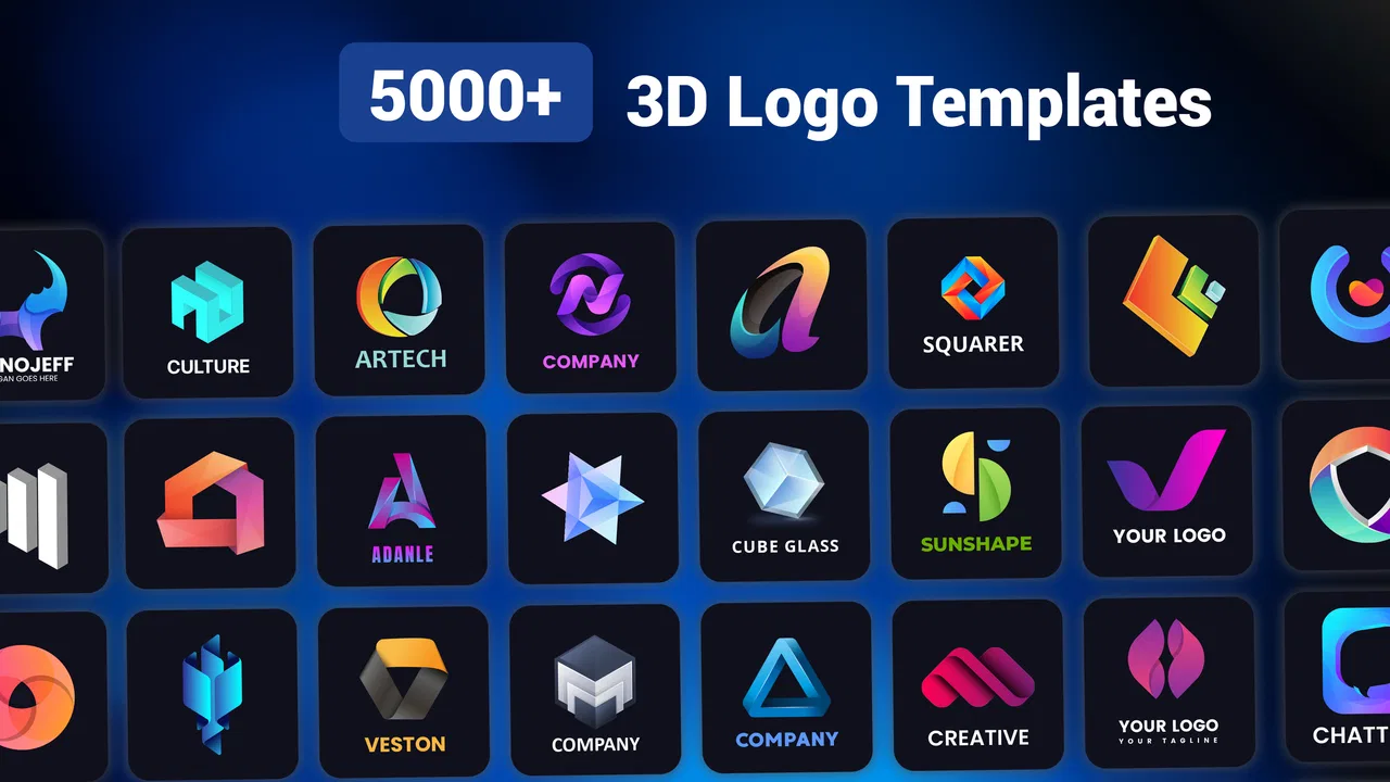
The strongest use case is an early-stage visual decision. Imagine I am preparing a small online bakery and need a profile image before announcing the page. I can use the app to test whether a rounded emblem, a bold wordmark, or a more dimensional symbol feels closer to the tone I want. Even if I do not use the first result, seeing several directions can help me explain what I like and what feels wrong.
That speed is useful because many people delay launching a project while waiting for a perfect logo. Here, I can create a rough identity and continue working on the important parts of the business. For a temporary event, a personal service, or an internal project, the convenience may matter more than absolute originality.
At the same time, I would not treat the first attractive result as finished design work. AI-assisted creation can produce something polished at a glance while still feeling familiar or generic when compared with other logos. I recommend looking at the result at small size, on a light background, on a dark background, and beside the business name. A logo that looks impressive in the editor may lose clarity when reduced to a social avatar or printed on a small label.
Where the three-dimensional approach helps
The 3D direction is most suitable when the project wants energy, depth, or a technology-oriented appearance. A gaming channel, a digital service, a youth-focused store, or a creator brand may benefit from that visual emphasis. The extra depth can make a quick concept feel more finished than a plain text treatment.
However, dimension is not automatically an advantage. A logo with shadows, highlights, or simulated volume can become difficult to reproduce consistently. It may work well on a phone screen but become awkward on packaging, embroidery, a receipt, or a single-color stamp. Before committing, I would create a simplified backup version in my head, even if the app's main result is more elaborate.
This is one of the app's less obvious trade-offs: the feature that makes the result immediately eye-catching can also reduce flexibility. If the business expects signage, uniforms, invoices, or formal documents, a flatter and more restrained design tool may be a better foundation.
My workflow for getting better results
I get more useful outcomes when I decide the practical job of the logo before opening the editor. I ask whether it will mainly appear as a profile picture, a storefront mark, a video watermark, or a small product label. That decision changes what matters most. A profile image can tolerate more visual detail, while a tiny label needs a strong silhouette and readable lettering.
I also avoid judging a design only by its colors. I first check the shape and text in a simple mental grayscale test. If the logo becomes confusing without color, the concept may depend too heavily on decoration. This is a valuable filter for AI-generated designs because color and effects can make weak structure look stronger than it is.
Another practical step is to make several deliberately different attempts rather than repeatedly asking for almost the same idea. For example, I might explore a symbol-first direction, a name-first direction, and a compact badge. Comparing these broad options is more productive than making tiny changes to one concept before I know whether its overall structure works.
Once I find a promising direction, I keep the wording consistent. A business name should be checked carefully for spelling, spacing, and capitalization before I use the result publicly. Automated design is helpful for visual exploration, but I still treat the final text as my responsibility. This matters especially for names with unusual spelling or mixed languages.
What existing users may notice in the present release
The current version gives the app a more concrete point of reference than an early experimental build. For someone returning after an older installation, the sensible approach is to review the creation flow again rather than assuming every screen behaves exactly as before. App interfaces can change in small ways, and a refreshed workflow may affect where editing or export controls appear.
I would also keep older logo files organized outside the app if they matter to a business. A logo is not something I want to rely on finding again through a creation history. Saving the chosen result in a clearly named folder, along with a note about the colors and wording, makes future reuse easier. This is especially important when an existing user is testing new concepts while still using an older logo publicly.
The app has a 4.6 average from around 71 thousand ratings, with more than five million installs. Those figures suggest that it has reached a substantial audience and that many people find the basic idea useful. They do not guarantee that every generated design will suit a particular industry, so I still recommend evaluating the result against the actual needs of the project rather than relying on popularity alone.
For returning users, the main benefit is continuity of purpose: it remains a fast business-oriented tool for exploring logo ideas, rather than trying to replace a complete professional design package. If I already have a logo that works, I would use the app for experiments or a secondary project instead of redesigning a mature identity without a clear reason.
Costs, access, and who should use it
The app is free to start, with in-app purchases ranging from $0.99 to $39.99 per item. I would approach that model with a specific plan. First, I would decide whether the free experience gives me enough confidence to continue. Then I would consider paying only when the result is genuinely useful for my intended project, rather than buying access simply because a design looks exciting in a preview.
This matters for casual users. If I only need a temporary icon for a private group, a school activity, or a one-time event, spending money may not make sense. A small business that will use the logo across packaging, social media, and customer communication has a stronger reason to consider a paid item, but should still check whether the resulting file and visual style fit those uses before making a commitment.
The Everyone content rating makes the app approachable for a broad audience. I see it working particularly well for first-time founders, students testing a business concept, independent creators, and people who need a visual placeholder quickly. It can also help a client and a designer communicate: a rough generated concept may be a useful reference for discussing mood, shape, or color before professional refinement.
I would skip it as my main tool if I need exact brand guidelines, detailed vector construction, advanced lettering control, or a carefully documented design system. In those cases, a conventional vector editor or a human designer is better suited. The extra effort buys control that a fast AI workflow intentionally does not prioritize.
Where it compares with familiar alternatives
Compared with a blank canvas in a traditional design app, this tool lowers the creative barrier. I do not have to begin with an empty page and invent every element from scratch. That is its clearest advantage for non-designers. The trade-off is that a blank canvas gives me more control over geometry, spacing, and originality once I know what I want.
Compared with template-based logo services, the AI angle can feel more exploratory. Templates are reassuring when I want to choose from established layouts, but they can encourage a logo to look like a variation of something many other businesses already use. A generated concept may offer a more personal starting point, although it still needs my judgement to avoid familiar visual patterns.
Compared with hiring a designer, the difference is not simply quality versus convenience. It is also about discovery. A designer can ask why the business exists, who it serves, and how the mark must work in different formats. This app is better when I am still answering those questions and need visual prompts. A professional is better when those answers are already clear and the logo must carry them consistently.
My preferred workflow would often combine the options: use the app to explore several broad directions, select the one with the strongest idea, and then refine it elsewhere if the business becomes serious. That avoids asking a quick mobile tool to solve every branding problem while still taking advantage of its speed.
Remaining gaps and practical friction
The largest limitation is the distance between a visually pleasing preview and a dependable brand asset. A logo has to survive different sizes, backgrounds, materials, and contexts. A detailed 3D treatment may not translate equally well everywhere. I would test it at thumbnail size and imagine it in one color before deciding that it is ready.
Another gap is creative ownership in the practical sense. When a result feels close to familiar styles, I may struggle to make it unmistakably connected to my business. The app can accelerate variation, but it cannot supply the personal story, market knowledge, or strategic positioning behind a strong identity. I still need to bring those decisions myself.
There is also a learning curve hidden inside the promise of simplicity. The buttons may be easy to understand, but choosing between several attractive options is not always easy. New users can mistake complexity for professionalism, or choose a symbol that says little about the actual business. I find it helpful to ask someone who knows the target audience what they notice first, rather than asking only whether they like the colors.
For an existing company, changing a logo also has a cost beyond design. Customers may recognize the old mark, and printed materials may remain in circulation. I would not replace an established identity just because the app produced a more modern-looking option. I would use it to test possibilities, then compare the strongest candidate with the current logo in real business situations.
What I would watch as the app develops
The current release is a useful snapshot of a product built around quick logo creation, and I would watch future changes in areas that affect long-term usability rather than only visual novelty. Better control over simplicity, legibility, and adaptation across formats would matter more to me than adding increasingly dramatic effects.
I would also pay attention to how comfortably the app supports the transition from idea to repeatable brand use. A business needs more than one attractive image. It needs a mark that can be recognized in a small avatar, placed beside text, and reused without losing its character. Any improvement that makes those decisions clearer would increase the app's value for serious users.
For existing users, the practical lesson is to treat updates as opportunities to reassess the workflow while keeping important exports safely stored. For new users, I recommend starting with a real scenario instead of browsing endlessly. Choose the business name, decide where the logo will appear first, create a few contrasting concepts, and test the best one at small size before considering an in-app purchase.
My recommendation
3D Logo Maker: AI Logo Creator is worth trying when I need a fast visual starting point and do not have professional design skills. Its business focus, accessible Android support, and free entry make it easy to explore, while the dimensional style can give a new project an immediate sense of presence. I especially like it for early concepts, temporary projects, creator pages, and conversations about brand direction.
I would be more cautious if the logo will become the permanent face of a company. In that situation, I would use the app as a sketching partner, not as the entire branding process. I would test readability, keep a backup of the chosen result, and consider professional refinement when the business begins appearing on products, signage, or formal materials.
Overall, I find the app most valuable at the moment when an idea needs a face but is not ready for a full identity project. It removes the intimidating blank page and helps me make visual decisions quickly. Its limits become clear when precision, originality, and long-term consistency matter more than speed. If that balance matches what you need, it is a practical first step; if you already know exactly how the brand must work, a more controlled design route will serve you better.
FAQs for 3D Logo Maker: AI Logo Creator
01What is 3D Logo Maker: AI Logo Creator used for?
3D Logo Maker: AI Logo Creator is designed for creating custom logos, brand marks, profile images, and promotional graphics directly from a mobile device. It combines editable templates, 3D-style effects, fonts, symbols, colors, and AI-assisted design features, making it useful for small businesses, content creators, gaming channels, online shops, and anyone who needs a logo without using advanced desktop design software.
02Does 3D Logo Maker: AI Logo Creator require professional design skills?
No professional design experience is generally required. The app provides ready-made templates and straightforward editing controls, so beginners can start by selecting a style and replacing the text, icons, colors, or background. However, creating a polished result may still require some experimentation, especially when adjusting spacing, layering, shadows, and three-dimensional effects to keep the logo readable at smaller sizes.
03Is 3D Logo Maker: AI Logo Creator free to download and use?
The application may be available to download for free, but some design assets, templates, AI tools, export options, or advanced editing features can be restricted behind in-app purchases or a subscription. Availability and pricing may vary between Android and iOS and can change with updates. Before confirming a purchase, check the app store listing and subscription terms carefully.
04Can logos created with the app be saved and shared in high quality?
The app typically allows users to save finished designs to their device and share them through supported apps or social platforms. Export quality, image resolution, file formats, and whether transparent backgrounds are available can depend on the selected feature or account plan. If you need a logo for printing, packaging, or professional branding, verify the available resolution before finalizing your design.
05Are logos made with 3D Logo Maker: AI Logo Creator unique and safe for commercial use?
The app can help produce distinctive-looking logos by combining templates, icons, text, colors, and effects, but template-based designs may resemble work created by other users. Commercial-use rights depend on the app’s license, the individual assets used, and any premium terms. For a business identity, review the provider’s usage policy and avoid assuming that every included graphic is exclusively yours.
Pros
- Simple drag-and-drop editor suitable for beginners
- AI suggestions can speed up initial logo concept creation
- Supports creating logos in multiple visual styles
- Useful for quick branding projects and social media graphics
- Preview tools help visualize designs before exporting
Cons
- Some advanced tools may require a paid subscription
- AI-generated designs may need manual refinement for originality
- Export options can vary depending on the selected plan
- Large project libraries may require considerable device storage
- Results may feel less distinctive than professionally designed logos

3D Logo Maker: AI Logo Creator
Gallery